Why I decided to make my own peaceful website
Published

Why I decided to make my own peaceful website
When I first returned to the company in 2019, the very first thing I wanted to do was to set up a website.
Searching has already become the way everyone looks for information, yet Ping-He was almost a blank space on the internet. We actually made one around 2010, but the internet changes too quickly; nobody in the company could maintain it, so the website was left abandoned there.
Seven years later, we rebuilt the entire website from scratch.
This time, we didn't look for anyone else.
1. Why I chose to outsource in 2019
At the time, there were two options: build it ourselves using platforms like WordPress or Wix, or find a web design company.
I ruled out building it myself. The barrier to entry was too high for me at the time, there wasn't enough time, and the most realistic issue was—when I got stuck, I didn't know who to ask. AI wasn't widespread back then, so when encountering problems, I could only search for answers in communities or forums on my own.
So I went straight to a web design company and asked them to make a simple website using a template that met our needs.
Under the conditions at the time, I believe that was the best solution.
2. The limitations of template-based websites are invisible when signing the contract
The cost of operating the backend is higher than expected.
Once, I moved an article from one column to another. The title was clearly filled in, but the location field turned red and popped up "Please select a category." The category was right there, and it was selected. It was impossible to tell what the issue was from the error message, nor did I know how to resolve this bug.
This kind of thing didn't just happen occasionally. The purpose of building our website was primarily for company image, which is different from general online shopping or owners who need frequent updates. The backend interface itself is not intuitive, making it easy to forget how to operate after not using it for a while. In addition, when an error was reported, the cause could not be found at all. In the end, I could only email the website company, attach screenshots, and use text to describe my problem or how I wanted to adjust it. However, I often received a reply saying "It's been fixed," but the result after the change was different from what I had imagined.
The layout is determined the moment you purchase it.
After selecting the template in 2019, wanting to redo the homepage later would incur an additional fee. What could be moved was very limited, and upon inquiry, anything I actually wanted to change turned out to be a new expense.
SEO can only do the basics.
I once wanted to change the URL to a custom path—for example, changing the product page to a structure like /products. The response I got was that this is a value-added feature that requires an extra fee to enable, and it must simultaneously be moved to an independent hosting environment, which would generate another hosting fee.
A basic setting that affects search results was something I couldn't change myself.
The structure cannot keep up with industry changes.
Digitalization has become very fast in recent years, and the layout and content of web pages should be adjusted accordingly. However, operation is not easy, and changing the structure is even more difficult; you are basically limited to the framework you bought back then.
But it does have its advantages.
As long as the content is prepared and the structure is thought through, you can get a responsive (RWD) website very quickly. This indeed helped a lot at the time.
3. What really made me decide to redo it was not the layout
The old website looked pretty, but doctors couldn't get answers after reading it.
The problem lay in the logic of the structure. Previously, we made a single page for each type of material—even down to the brand; for example, 3M Lava had its own page. Doctors would click in, finish reading that page, and then that was it.
But the questions in the doctors' hands are never "please tell me what 3M Lava is." Instead, they have a case with certain conditions and limitations, and what they need to know is whether this choice is good under these premises, or if there are other ways to do it.
If a page simply talks about one material, it cannot answer this kind of question.


The product introduction page of the old website in 2019, arranged in a directory format.
I wanted to add a material comparison table to the prosthodontics category because I believed this was the answer dentists would want to get. However, this was very difficult to achieve under the old website.
Furthermore, there was no link between each prosthodontic item and the case studies. After dentists finished reading about an item, they couldn't proceed to see actual cases; after reading a case, they couldn't go back to the material assessment. The information was all there, but it was scattered everywhere.
So, the website's issue shifted from "is it good-looking?" to "dentists can't find the answers and information they need."
IV. I Asked a Website Company First
Actually, I didn't decide to do it myself right from the start.
I first inquired with a specialized website development company, and also asked a marketing agency about packages that combined marketing with website creation. The prices were on the higher side, and the communication and verification process was tedious. But what truly made me stop and think was realizing that even after completion, there would still be limitations on content layout. Whenever major changes were needed, I would still have to trouble the vendor, which could incur additional costs. A few years down the line, I would end up right back where I was in 2019.
V. Why Framer?
Those I tried first.
Starting last year, I tried Vercel's v0, Figma's AI Agent, and Google Stitch one after another.
The common ground among these tools is that they are code-based editing. It’s very fast at the beginning, allowing you to build a website with about 70% completeness. But when you start to refine the details, it becomes extremely tedious.
Moreover, my situation is a bit different from most: Heiho already had a predecessor website with a very clear structure, and its complexity was much higher than that of a one-page website. Those tools work well in single-page scenarios, greatly improving efficiency. But once there are many pages and the structure goes deep, the maintenance cost becomes high.
Why I chose Framer in the end.
There are many templates to choose from on the Marketplace, official tutorial resources are abundant, and the tutorials on YouTube are explained clearly. I already had experience using Figma, so facing some of Framer's features wasn't too unfamiliar; Figma also has a Figma to Framer widget, which lowered the initial learning curve.
Given my conditions at the time, Framer was the only choice I could pick up quickly.
VI. Where a Person with No Design Background Actually Got Stuck
The first method failed.
At first, I wanted to arrange the layout in Figma first, and then transfer it over using the Figma to Framer tool. But after transferring, I realized that components and interactive animations still had to be set up again in Framer—meaning it didn't save much time.
Later, I changed the approach.
I directly browsed a large number of Framer cases, found templates I deemed suitable, and then made adjustments and modifications. Interactions and components were all set up directly within Framer.
Ask when encountering things I didn't understand.
When coming across unfamiliar design terms or features, I directly asked Gemini or Claude. The advantage of Gemini is that it can directly bring up tutorial videos on YouTube, allowing me to follow along while watching the video; as for Claude, when you get stuck using a certain feature, it can provide relatively accurate, step-by-step operating procedures.
Time spent.
From starting to explore and find suitable templates, to actually creating the prototype of the current website, it took about half a year off and on.
VII. What Order Was the New Website Structure Arranged In?
First determine the restoration type, then decide on the material.
For a clinical case, after assessing the patient's conditions, the dentist must first decide whether to make a crown, veneer, or inlay/onlay. Once the restoration type is set, then comes the material—under this premise, which one can achieve aesthetic standards while meeting clinical conditions.
Therefore, the website's structure was rebuilt in this order: first select the restoration type, and then look down at the material comparison table.
There is another benefit to doing this. Previously, one material had one page, and once read, that was it; now, with the same content placed in a comparison table, you can see what other options are available under similar conditions.
The websites of several major labs abroad also mostly follow this structure, starting with the restoration type and then moving down to the materials.

The case study page of the old website from 2019 had a photo layout that lacked systematic organization.

Framer Marketplace page, showcasing a list of website templates to choose from

The Framer editor interface, displaying the layer structure and component parameter settings

The material comparison chart for the new website is presented, categorized by prosthesis type.
A link button has been added between restorative items and case sharing.
On each restorative type page, we have placed a direct button that links to the corresponding cases. When dentists are viewing a specific restorative type and want to see what the actual result looks like, they don't need to return to the homepage to search again. This is something the old website didn't have.
Go Digital is a separate page specifically created for digital workflows.
Dentists who are just starting to step into digitalization most want to know, "How do I collaborate with the dental lab?"—whether you can receive files from a certain brand of intraoral scanner, which materials can be fabricated digitally, and which cases do not require 3D model printing.
We have answered these questions many times over the phone and in messages. Since these questions are repeatedly asked, there should be a place where these answers are clearly written.
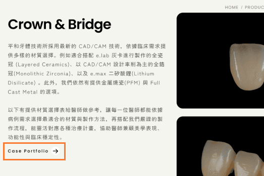
New prosthodontics product page on the website, featuring buttons linked to clinical cases

The Go Digital page of the new website, explaining the digital collaboration process
This website is not the most perfect version, and we will continue to modify and optimize it in the future.
But this time, what to put on each page and how to arrange the order were all decided by ourselves.
PING HO DENTAL LAB — WHERE ACCURACY MEETS AESTHETICS
